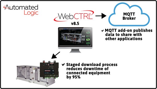
Automated Logic’s superior graphics illuminate the path to cost savings, comfort and peace-of-mind.
Most current ACES customers appreciate the color-rich graphical reporting available in the Automated Logic system. But talk to the customers who’ve worked with the data outputs from competing systems and one better understands the advantages of Automatic Logic’s WebCTRL graphics.
“It’s like night and day,” said one ACES customer. “When I was using a competitor’s system, I was basically given an Excel spreadsheet of the data. The issues and answers are in there. I just had to spend time to find them. With the WebCTRL system I get clear graphics and easy-to-understand reporting that helps me take action to save utility costs and stay ahead of problems.”
The WebCTRL system – sold, installed and serviced by ACES — offers users efficiency and productivity in one streamlined interface. This provides maximum flexibility for operators by combining data into powerful visualizations that are easily understood. Visualizations include horizontal bar charts, vertical bar charts, line charts, pie charts and verbiage, plus other options, all in vivid color. The result is simplified management of building operations, increased occupant comfort, and enhanced efficiencies.
Specific optimization capabilities through the graphics include:
- Utility cost savings
- More efficient use of equipment, which leads to less stress on the equipment
- Ability to reset demand levels for larger equipment
- Setting specific zones to optimal comfort
- Ability to fix “problem areas”
- Reduced carbon footprint
“Our dashboards are a tool for optimizing your system,” said Justin Vogt, ACES president. “The degree of optimization is up to the user, and our team works closely with customers to help them get the most from it.” In addition to on-site system lessons, ACES includes graphics tutorials in their training classes.
For more information about Automatic Logic’s WebCTRL graphics, contact your ACES rep, or schedule a system demo.


